Storefront Image Asset Design
One Piece, Boruto & Naruto Shippuden - ADN - Amazon Prime Video Channels
Overview
The goal for these projects is to create a cohesive set of images for a channel's storefront on Prime Video using assets from the movie or show that the channel wants to feature. As a visual designer one needs to focus on the visual details of the imagery sent by studios like ADN. We then create around 50-70 images while focusing on and cleaning up the details of each of these images that will be seen on different devices like TVs, phones, desktops. We try to make sure that sufficient attention will be drawn to the visual details of each image like the character's faces, show/movie titles and other nuances of the shows and movies are visible and clear on each device.
The user should be able to peruse through the Channels store on any device and every channel needs to stand out to the user through it's visuals.

Other Channels, Shows and Movies that I made Storefront Images for
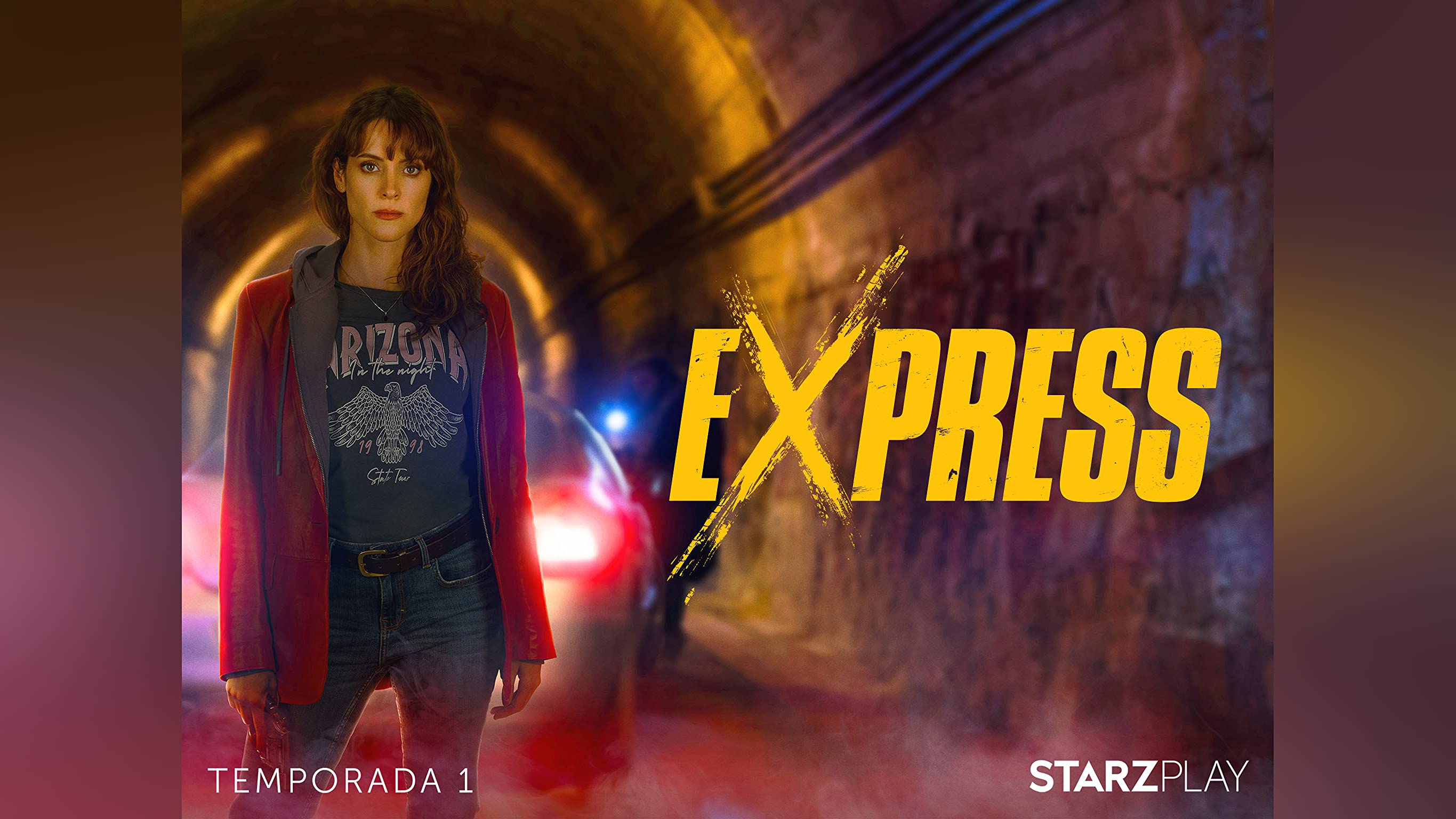
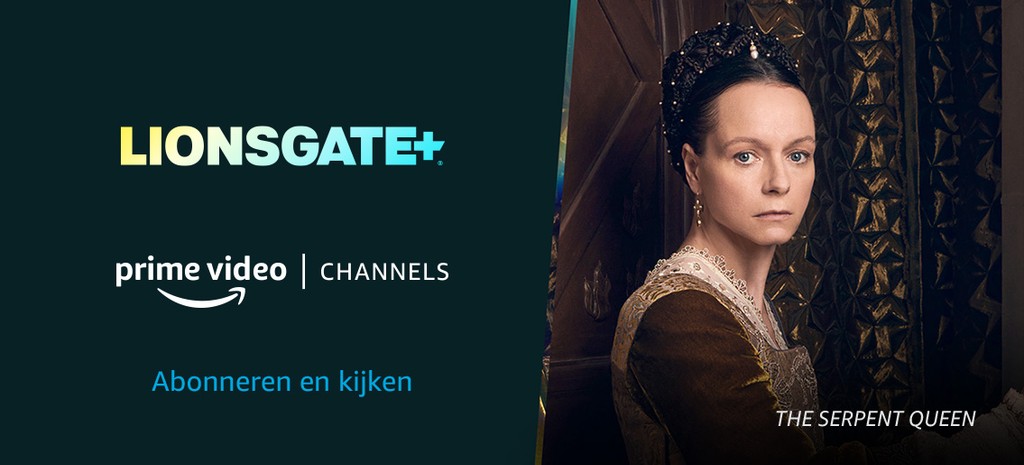
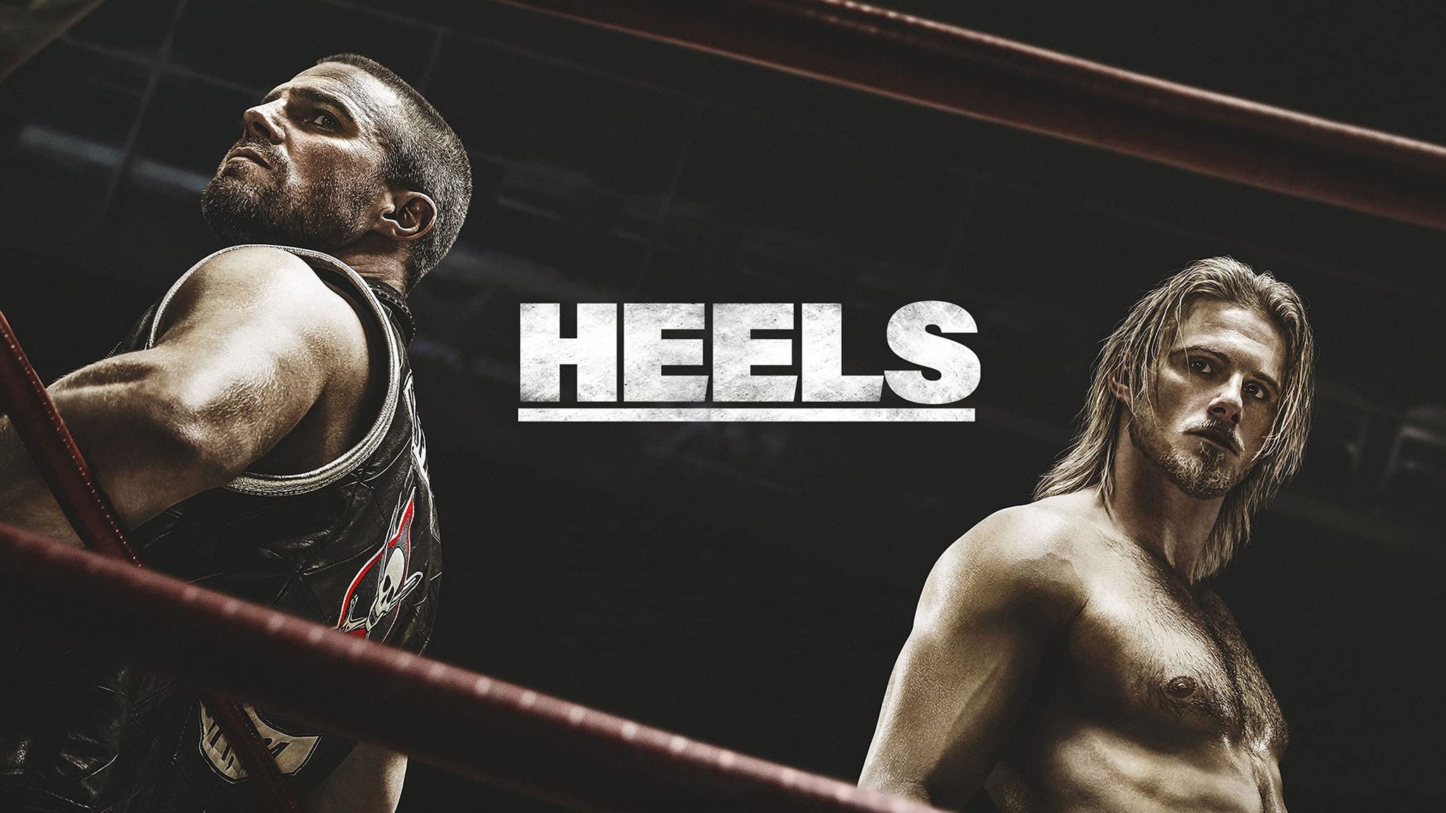
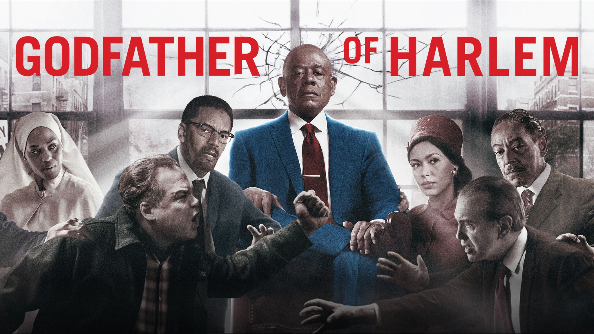
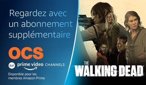
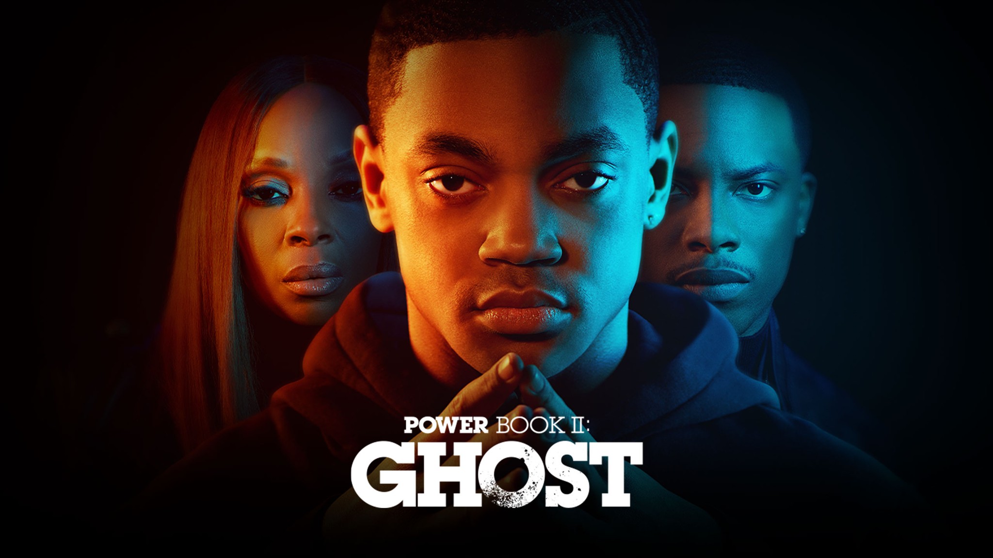
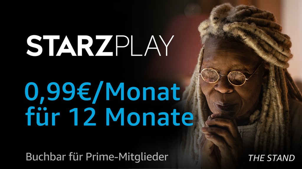
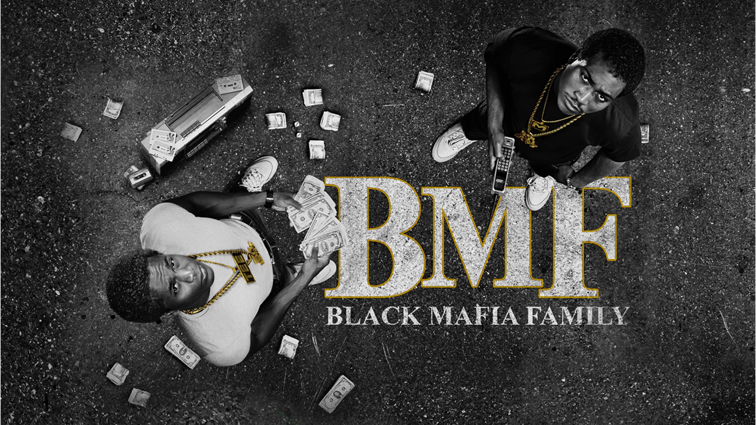
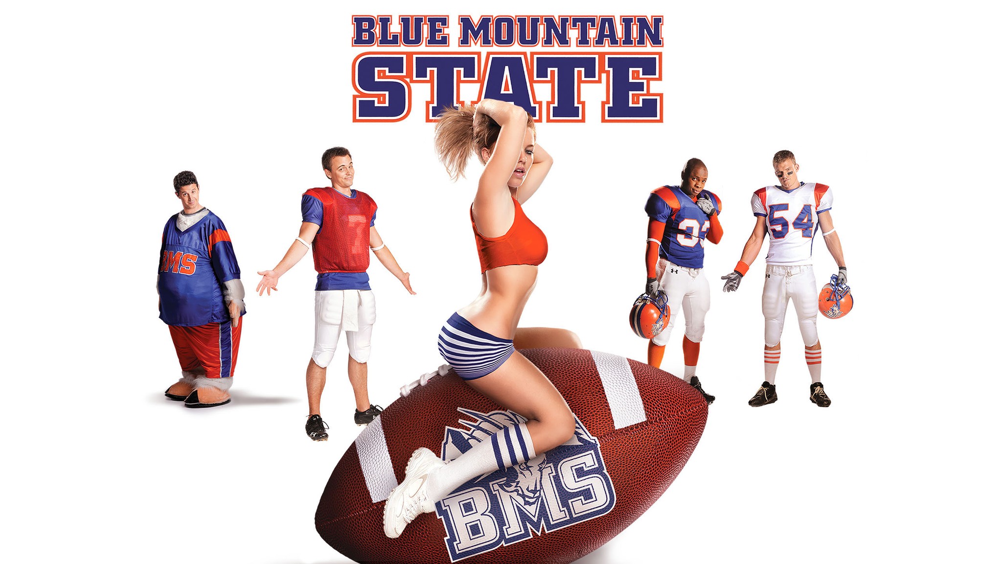
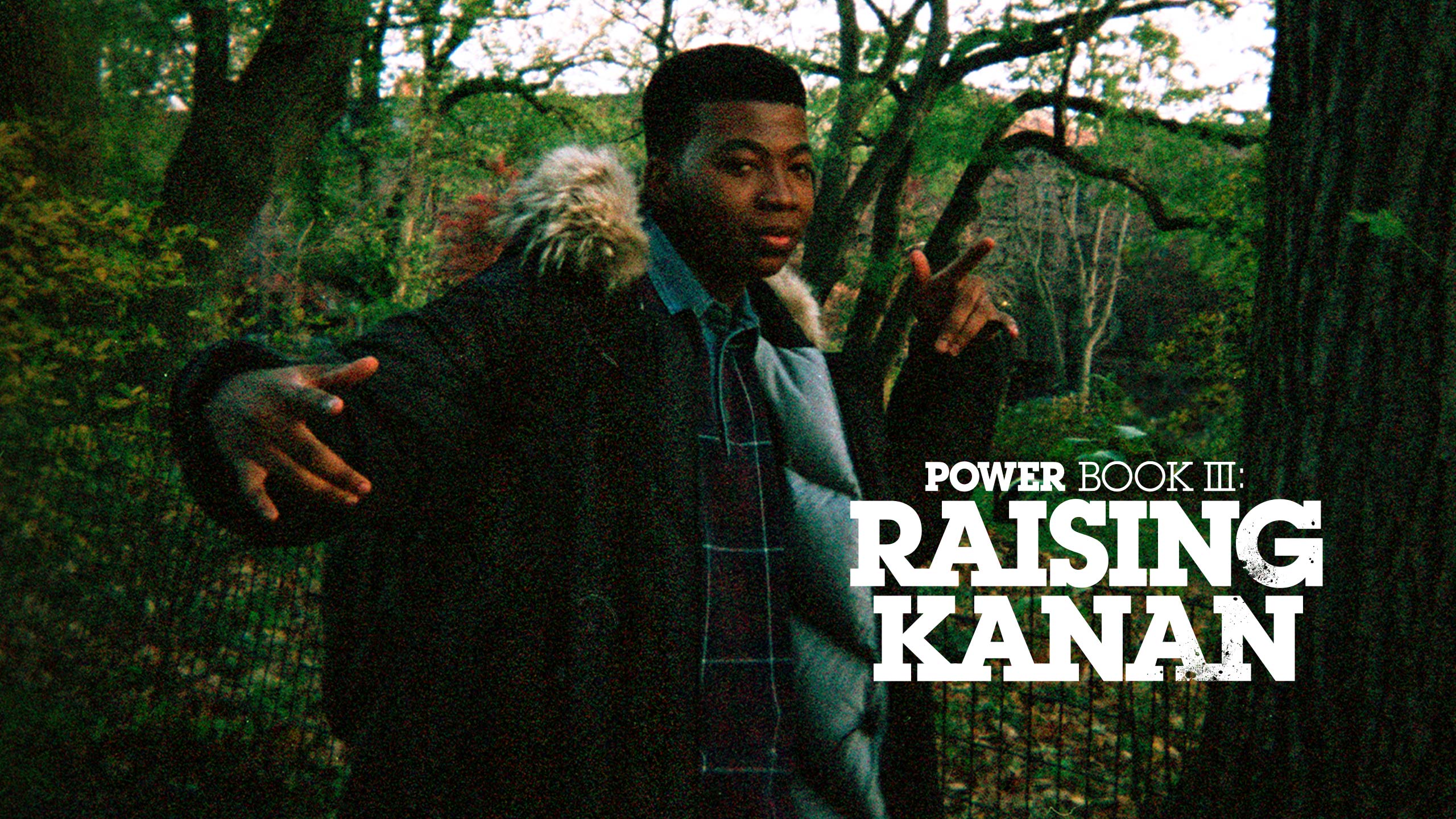
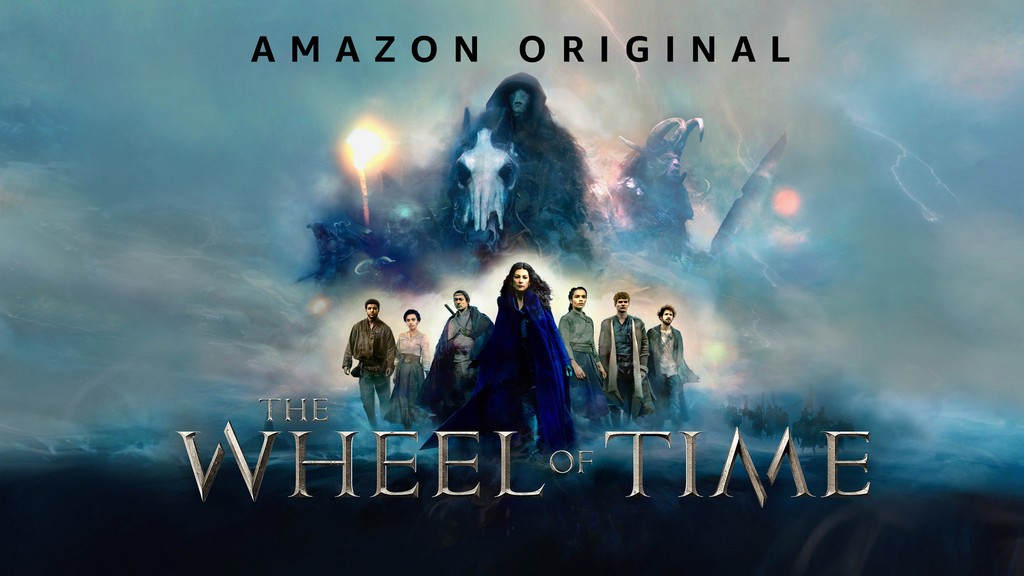
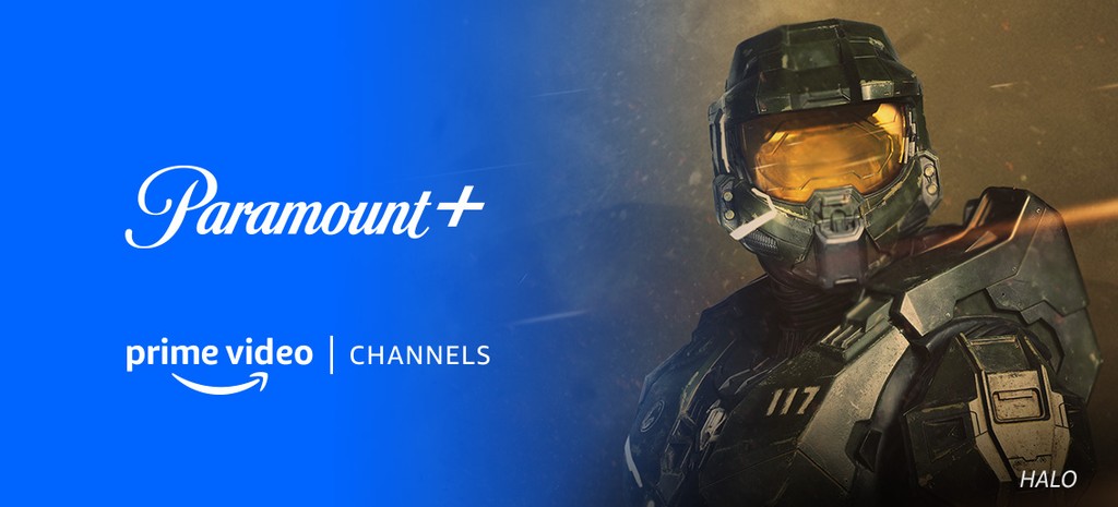
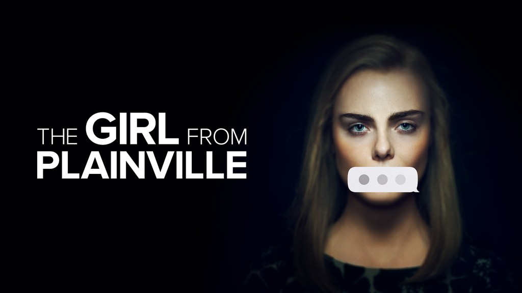
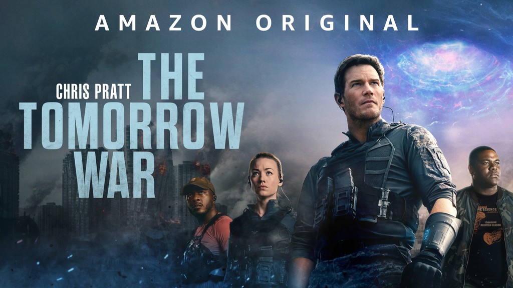
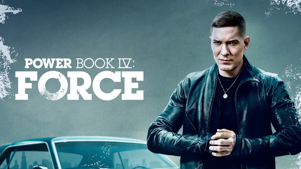
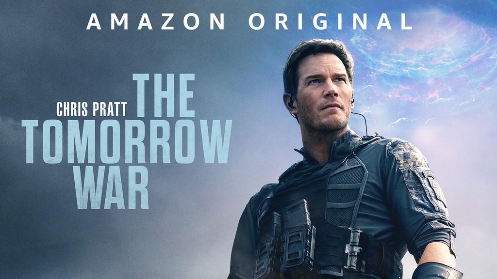
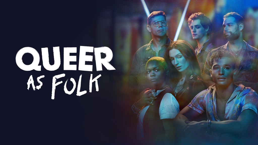
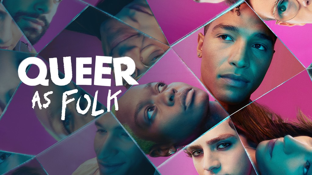
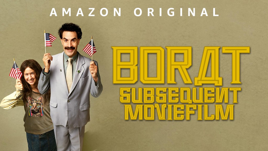
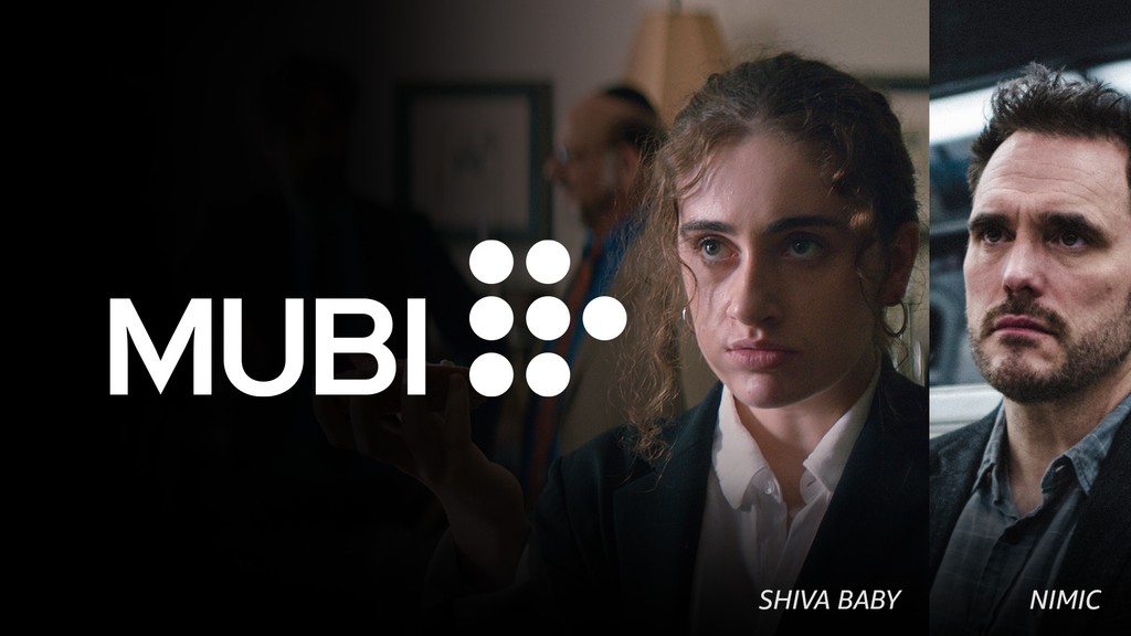
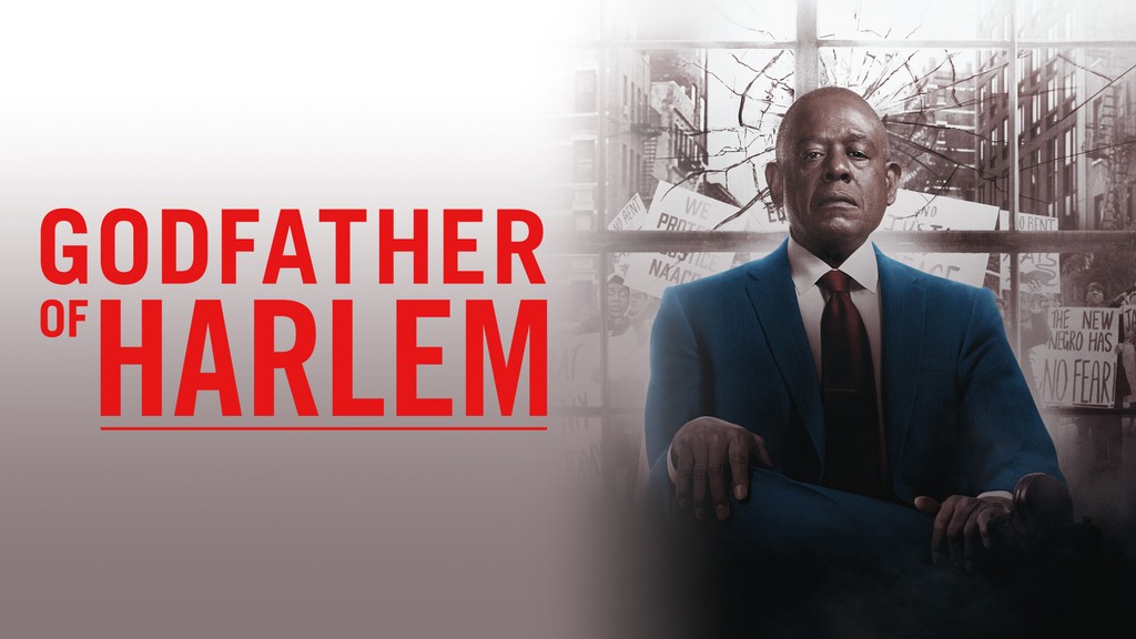
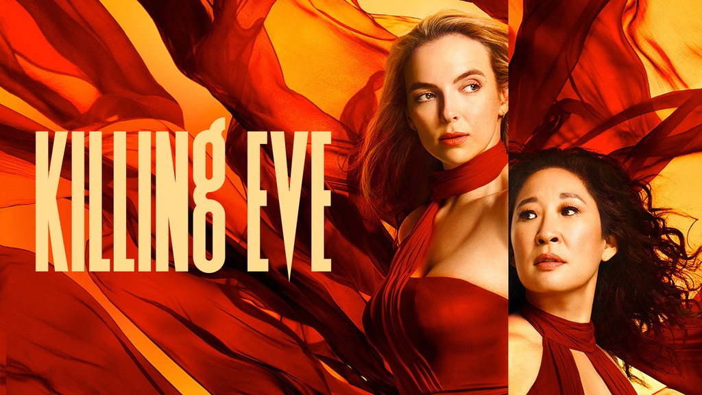
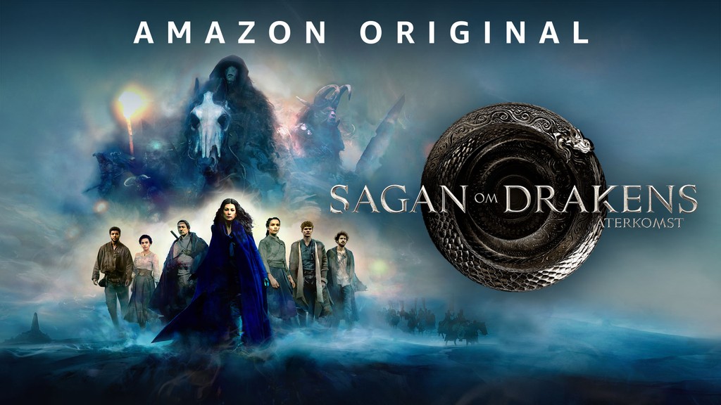
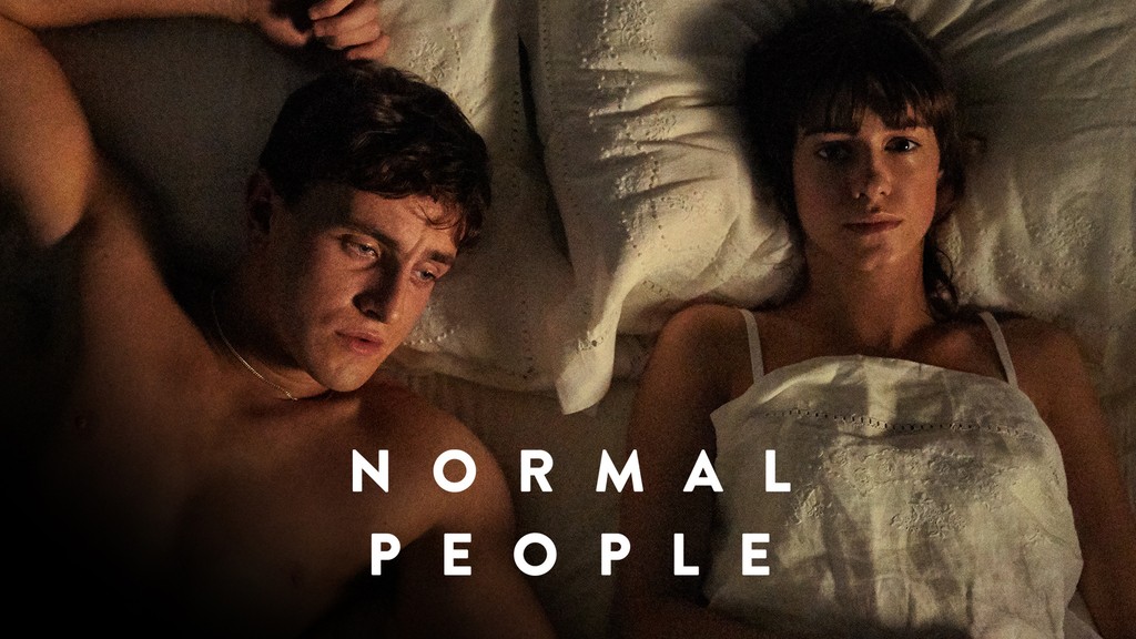
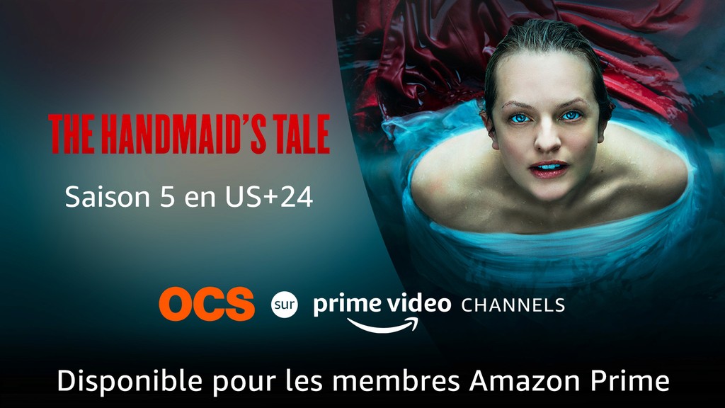
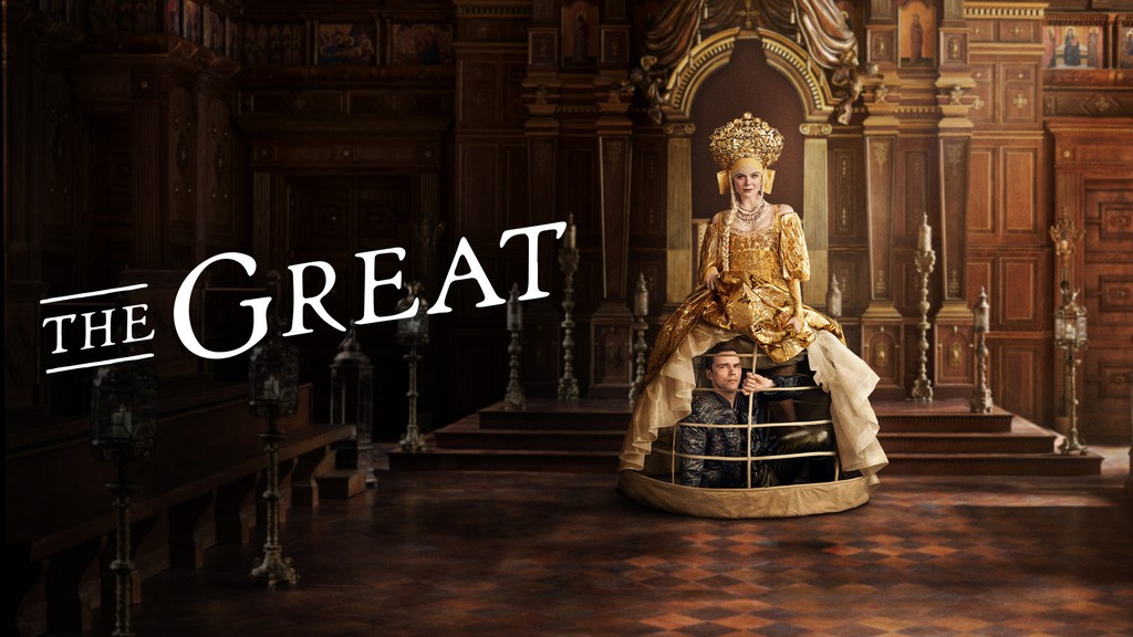
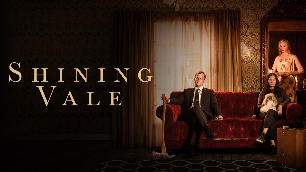
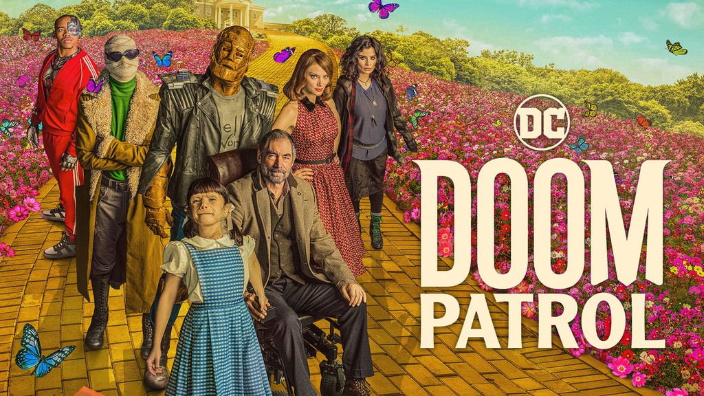
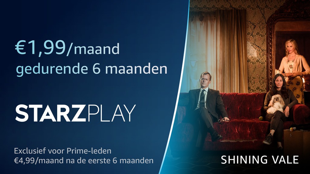
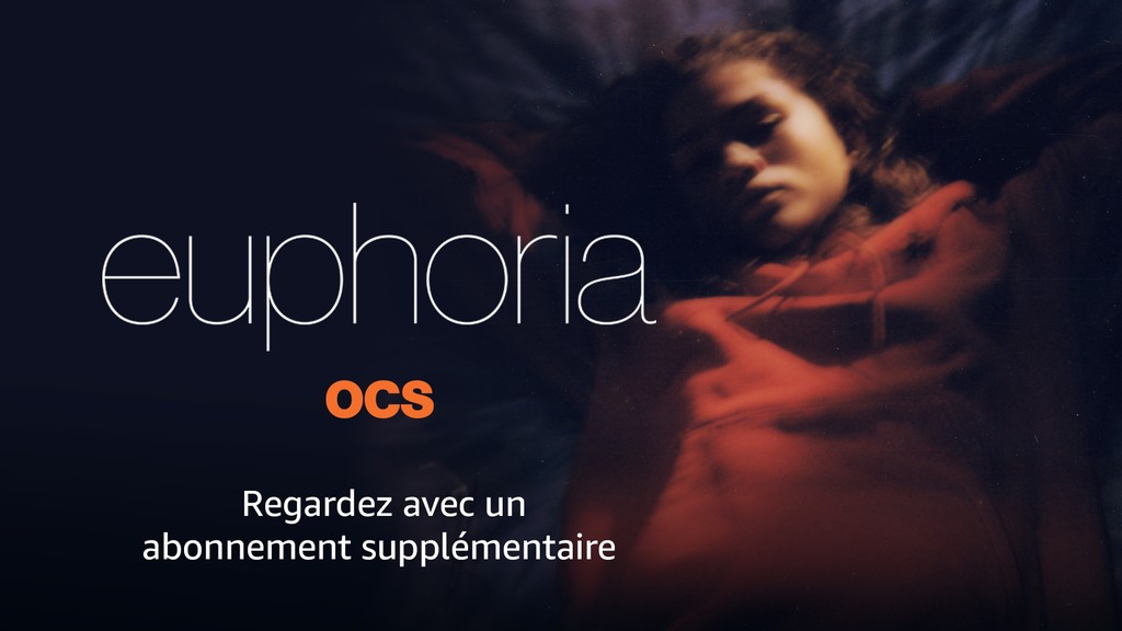
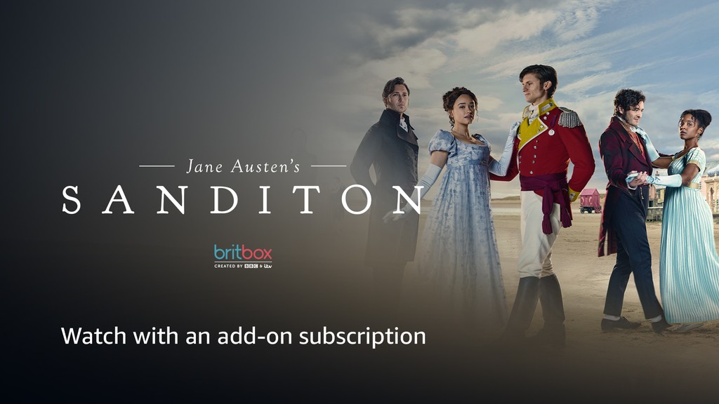
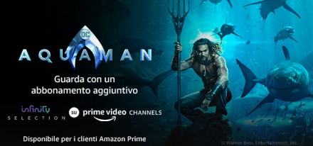
Similar to this project for ADN, during my time at Amazon Prime Video I made storefront & promotional image assets for movies and TV shows of channels on Prime Video. Below are some examples.
Designing Storefront & Merchandising image assets
Image asset design for storefront merchandising on Prime Video website
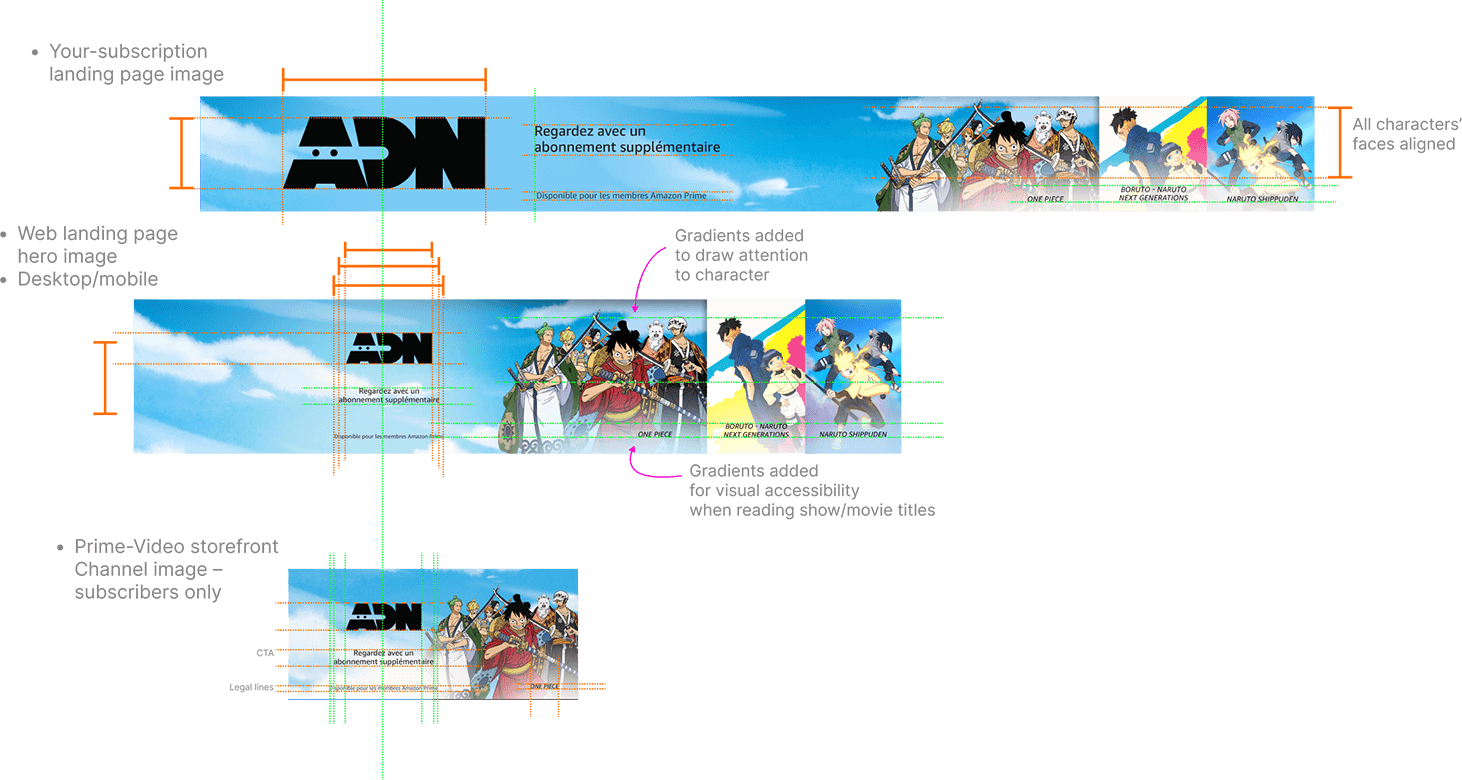
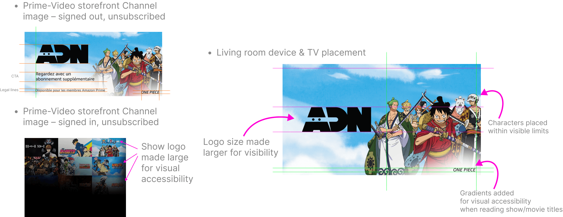
Photoshop output
The photoshop file would generate athe below image assets in various dimensions and file sizes to suit the device requirements
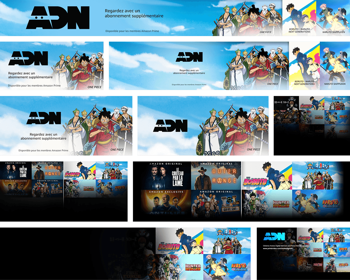
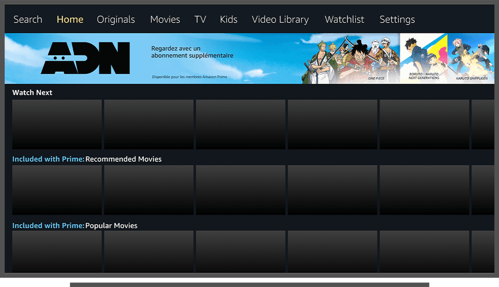
In situ - Living room device - Storefront images - for subscribed users
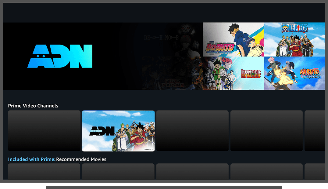
In situ - Living room device - Storefront images - for subscribed users on TV browser
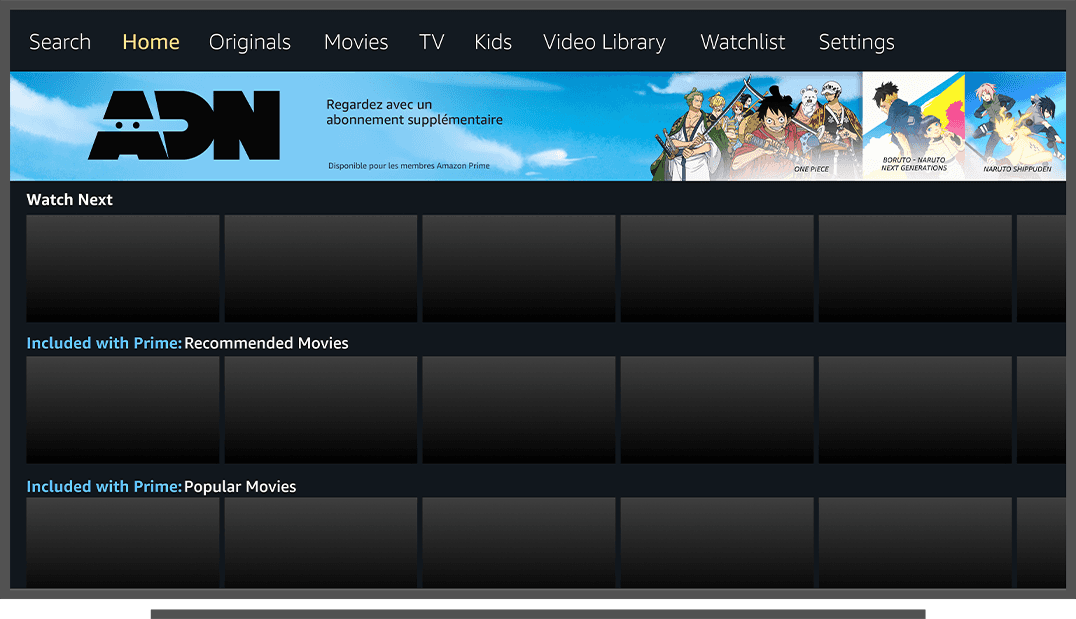
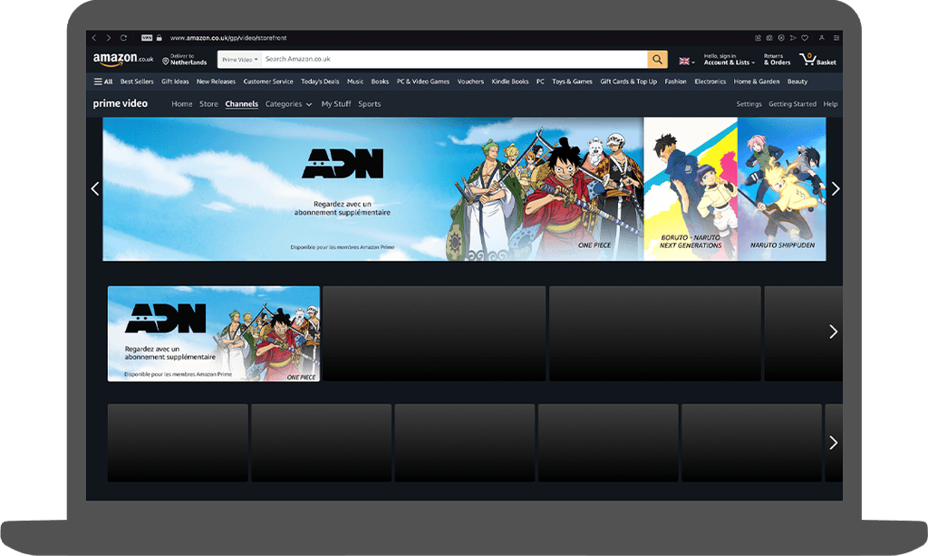
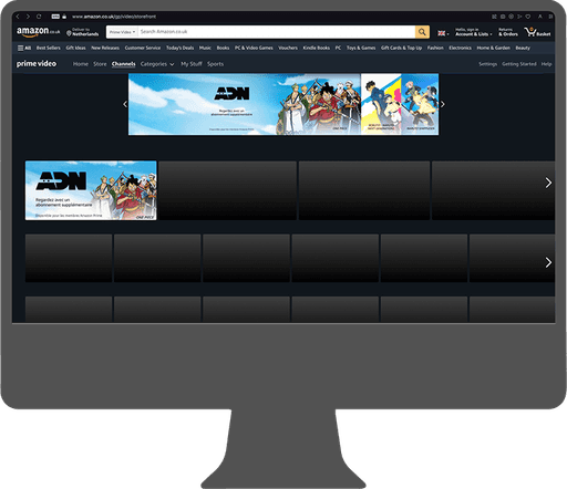
In situ - Desktop - Storefront images - for subscribed users

In situ - Desktop - Storefront images - for subscribed users on larger screens

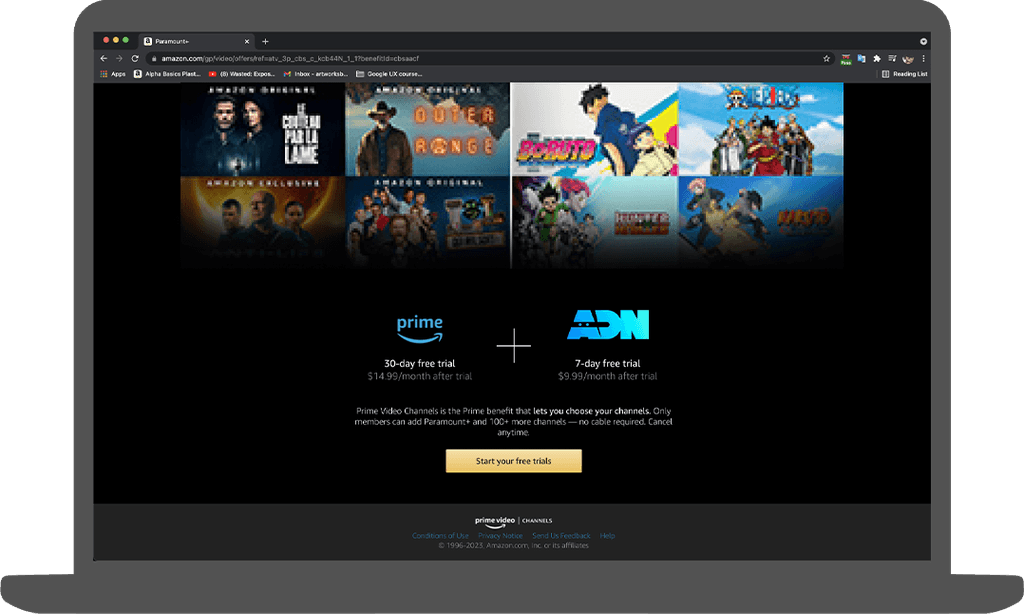
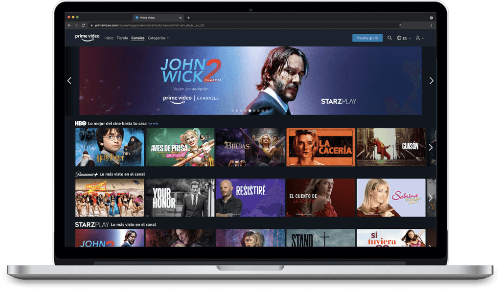
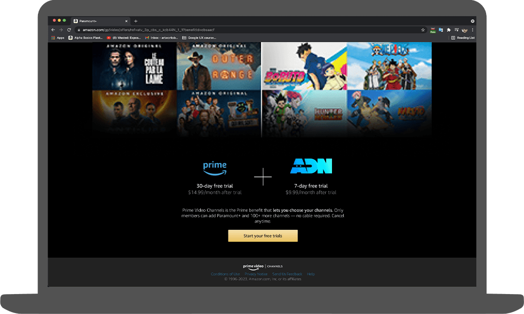
In situ - Desktop - Storefront images - for unsubscribed users
This collage consists of all the shows and movies featured on the channel. It is important to note here that each image can only take up 1/16 of the screen and there is a max-width of 1280px set. This is about 160px x 80px per image. As this is a very tiny area to work with, the main focus needs to be on the text while also making sure that the character's faces don't get swept under the gradient.
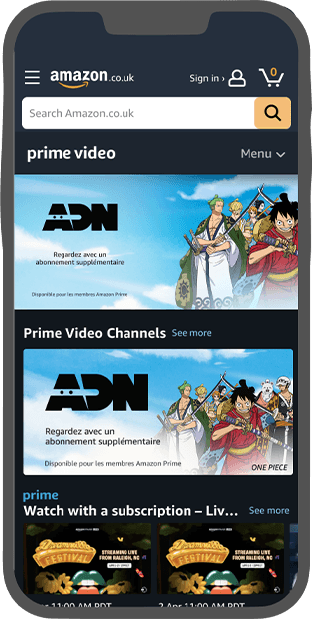
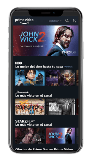
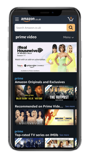
In situ - Mobile - Storefront images - for both subscribed & unsubscribed users
