Packaging Design Concept
Fabindia - Food
Overview
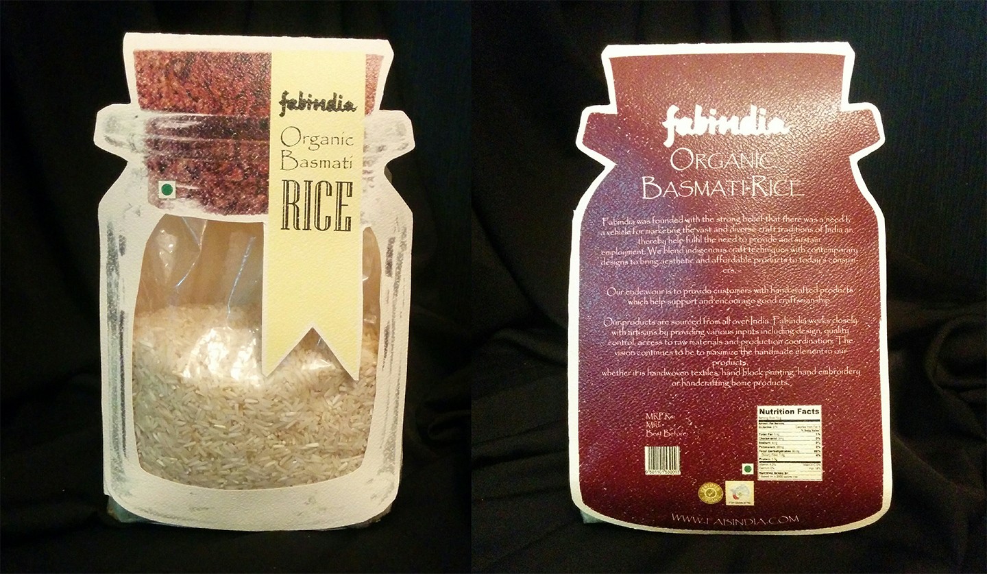
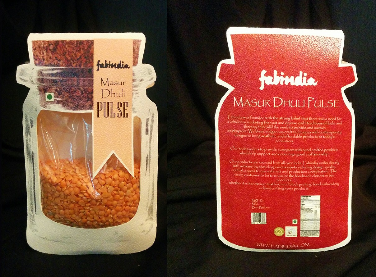
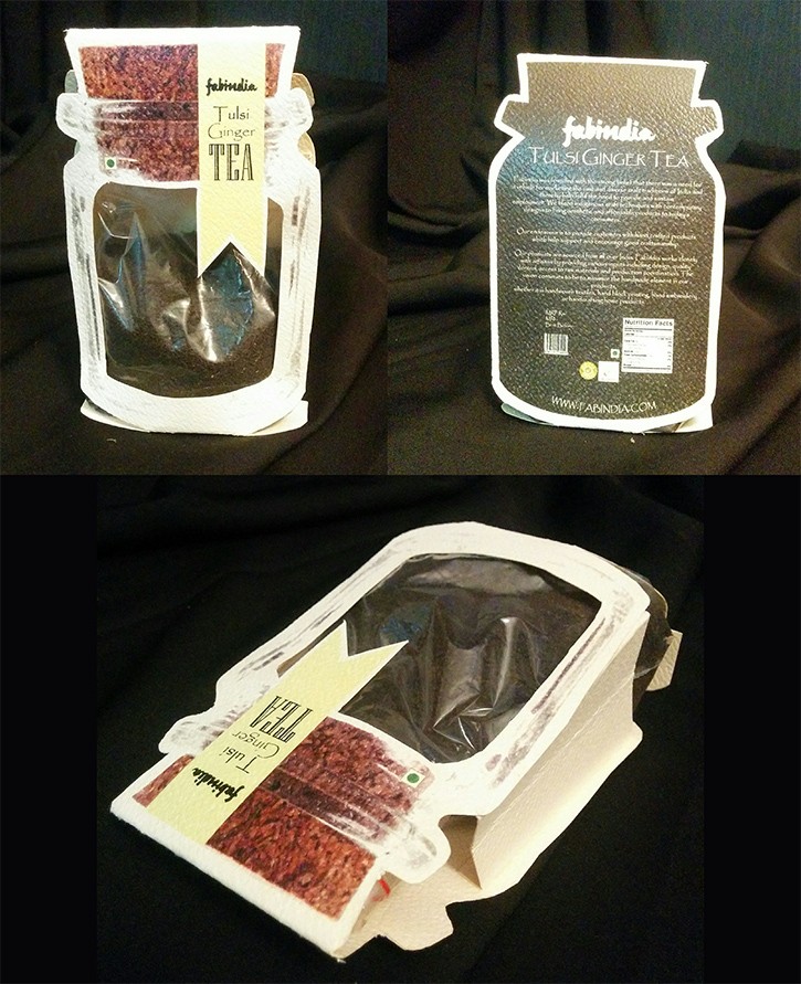
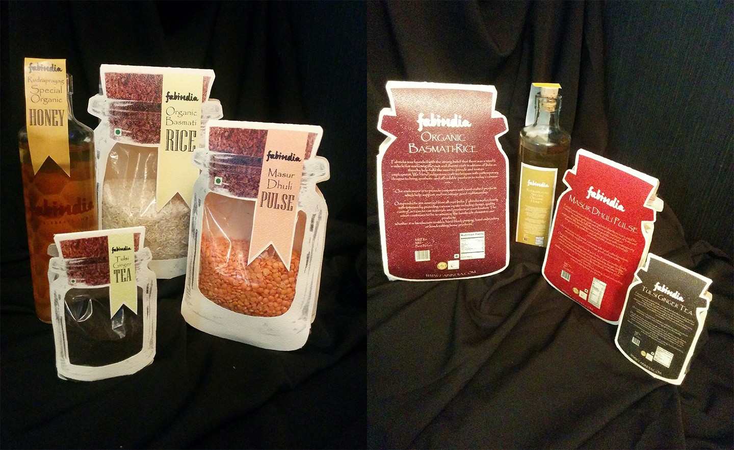
This packaging design project for Fabindia focuses on creating functional, aesthetically pleasing solutions that align with the brand's values and product offerings. The first design features a packaging solution for dry ingredients such as organic basmati rice, tea, and masoor dal; where I aimed to combine practicality with visual appeal. The design incorporates a glass jar-inspired look with the durability of plastic, ensuring both protection and ease of use. Thoughtful details like a resealable ziplock, a clear viewing window, and a minimalistic approach to printing enhance the user experience while maintaining the product’s freshness and readability.
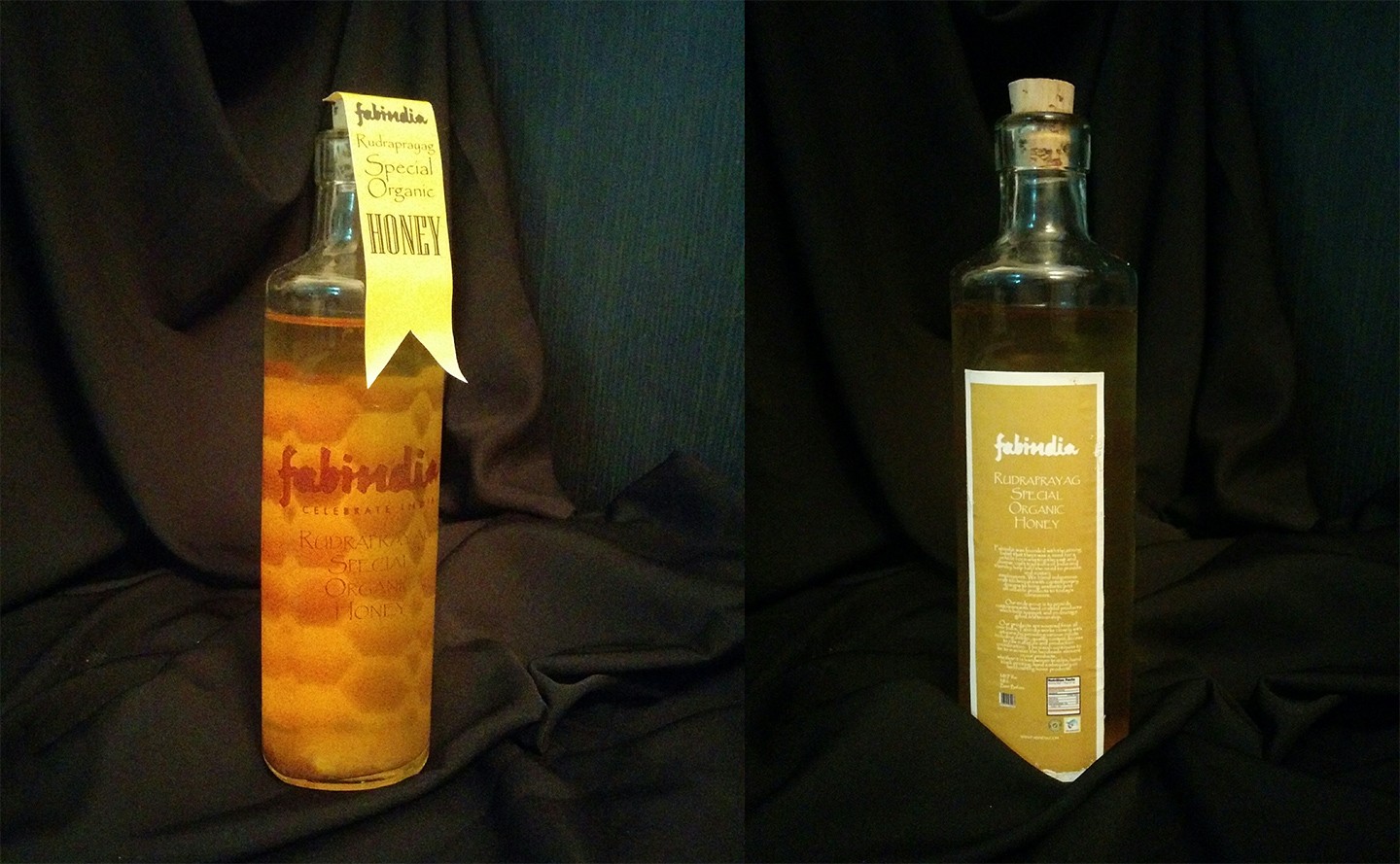
In the second design, I explored a premium approach for Fabindia’s honey packaging. By using a glass bottle with a cork closure, I emphasized the rustic and luxury feel of the product. Inspired by Quâ water bottles, the second-surface printing technique adds depth, allowing the honeycomb pattern to subtly reinforce the product’s identity. Although I experimented with label color choices, I later recognized the need for better readability, which would have been achieved with a white label. The back of the bottle is reserved for essential information, keeping the front clean and elegant.
Both designs reflect a balance between form and function, ensuring that the packaging not only protects and preserves the product but also conveys the brand's ethos and aesthetic appeal.

Problem Statement
The challenge of this project was to design packaging for Fabindia's organic food products that not only preserves the quality and freshness of the contents but also aligns with the brand's identity of offering artisanal and authentic products. The packaging needed to be functional, sustainable, and visually appealing while effectively communicating the brand’s values. Additionally, the design had to meet regulatory requirements, provide a premium feel, and ensure ease of use for the consumer. Balancing these elements, while maintaining cost-effectiveness and scalability, was a key focus throughout the design process.
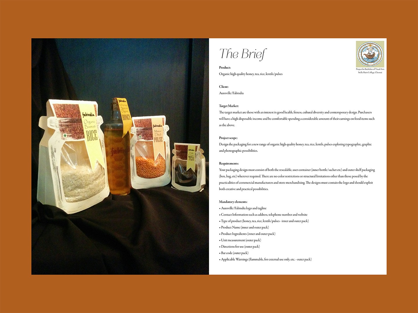
Since this was a university assignment, I have included a screenshot of the brief given for this project.
Design details - Dry Items
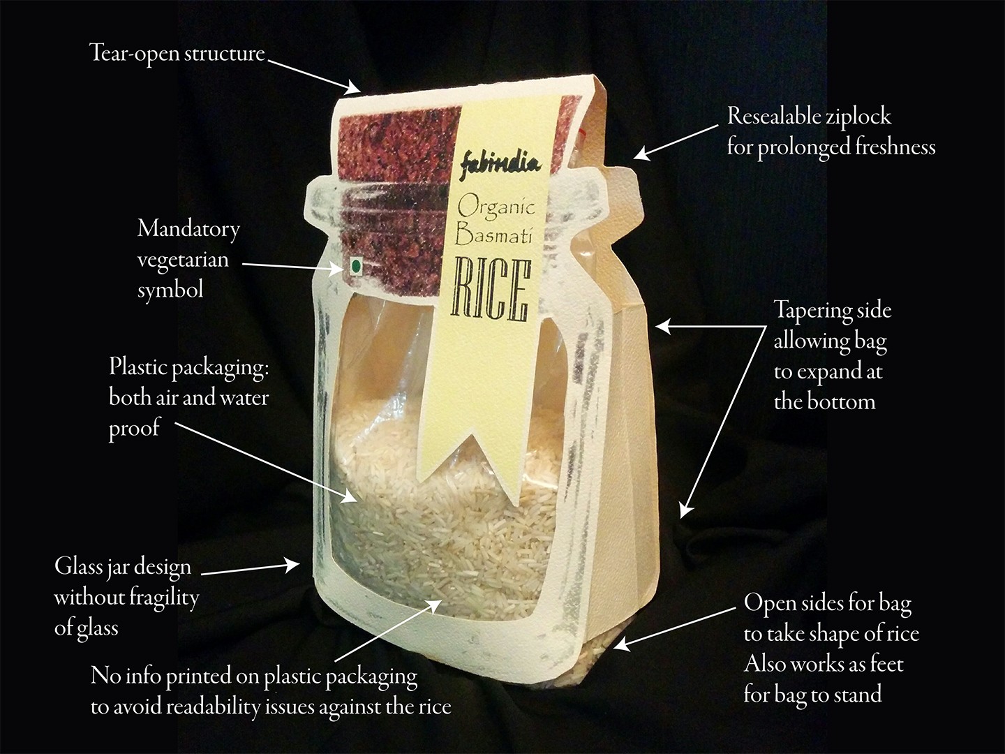
In this packaging design, my goal was to create a functional and visually appealing product that addresses both user convenience and branding requirements. I started by considering the practical aspects of the packaging, ensuring that it protects the product from air and water while maintaining freshness. The resealable ziplock feature allows for prolonged storage, while the tear-open structure ensures ease of use. I opted for a glass jar design, but replaced the material with plastic to eliminate the fragility while still giving the product a premium look. The packaging tapers at the sides to allow the bag to expand at the bottom, enabling it to stand upright, which is both practical for display and storage. Additionally, I avoided printing any information on the clear plastic area to ensure the text remains legible without competing with the visual texture of the rice. Finally, I incorporated essential details like the mandatory vegetarian symbol, ensuring the packaging meets regulatory standards while aligning with consumer expectations. This design combines functionality, aesthetics, and compliance, resulting in a user-friendly package that also serves as an effective marketing tool.
Design details - Wet Items
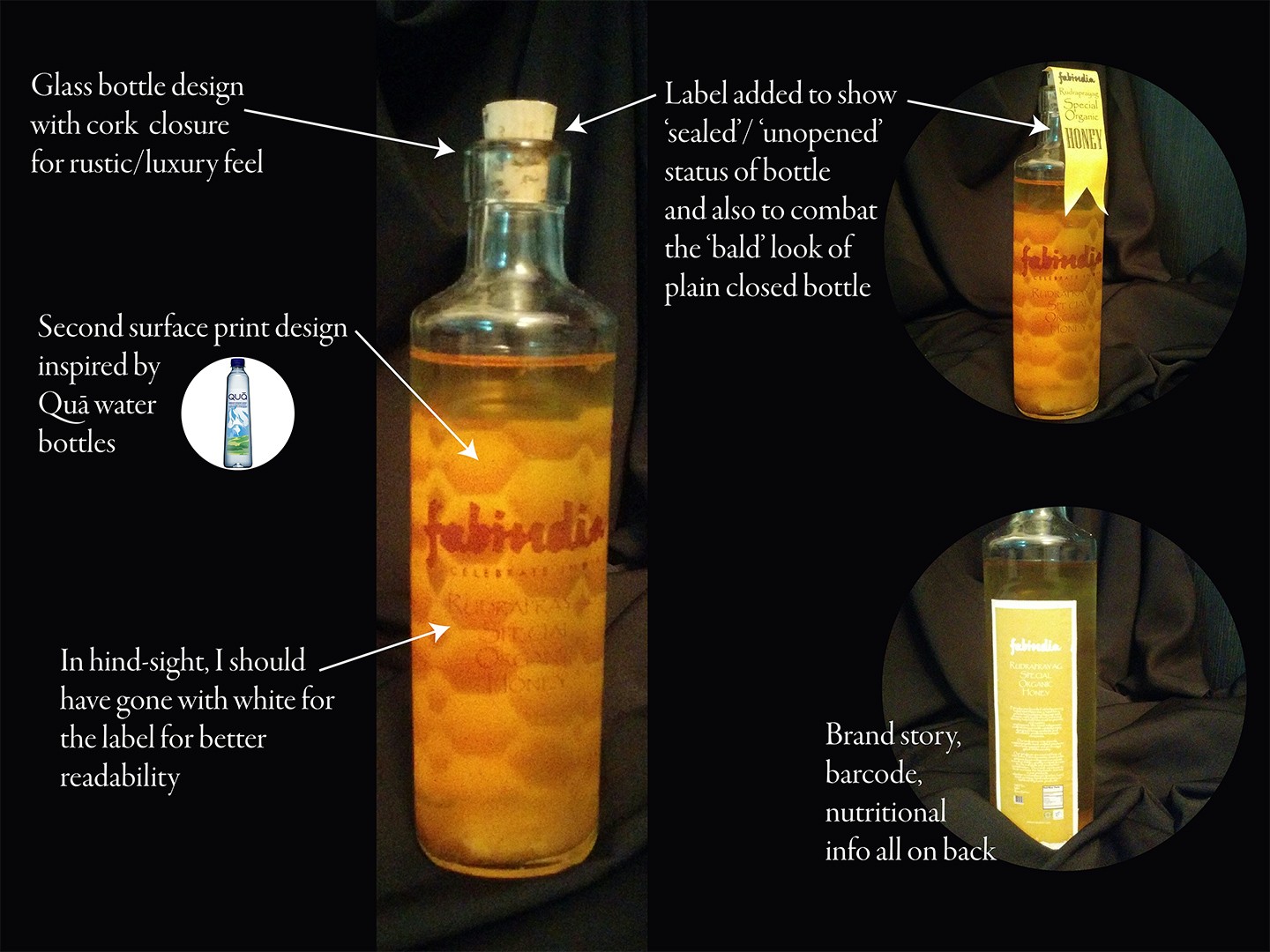
In this packaging design, my focus was on creating a premium and rustic feel that aligns with the product's artisanal nature. I chose a glass bottle to convey a sense of luxury and added a cork closure to enhance the rustic aesthetic. Drawing inspiration from Quâ water bottles, I incorporated a second-surface print technique to add depth and visual interest to the design. The honeycomb pattern on the bottle subtly reinforces the product's content while maintaining an elegant look. One of my design decisions was to add a label around the neck of the bottle, not only to indicate the sealed and unopened status but also to avoid the "bald" appearance that a plain closed bottle might have. In hindsight, I realize that using a white color for the label would have improved readability against the amber liquid inside the bottle. The back of the bottle contains essential information like the brand story, barcode, and nutritional details, keeping the front clean and visually appealing. This design balances aesthetics with functionality, creating a packaging solution that is both eye-catching and informative.
Product Mockups
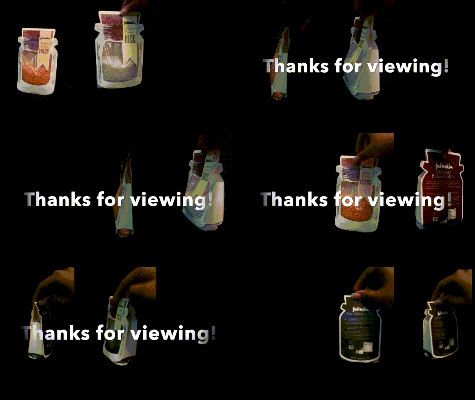
Final product mockups were created to visually represent how these packaging designs will look in real-world settings. These mockups provide a tangible glimpse of the finished product, showcasing how the design elements come together harmoniously to create an impactful and cohesive packaging solution for Fabindia.
Conclusion
In conclusion, this project successfully brought together the essential elements of functionality, brand identity, and user experience in packaging design for Fabindia. Each design choice was made with careful consideration of both practicality and aesthetics, ensuring that the packaging serves as a protective vessel while also acting as an effective marketing tool. The rice packaging, with its blend of traditional design elements and modern convenience, and the honey packaging, which balances luxury with rustic charm, both demonstrate how thoughtful design can elevate a product's presence on the shelf.
